
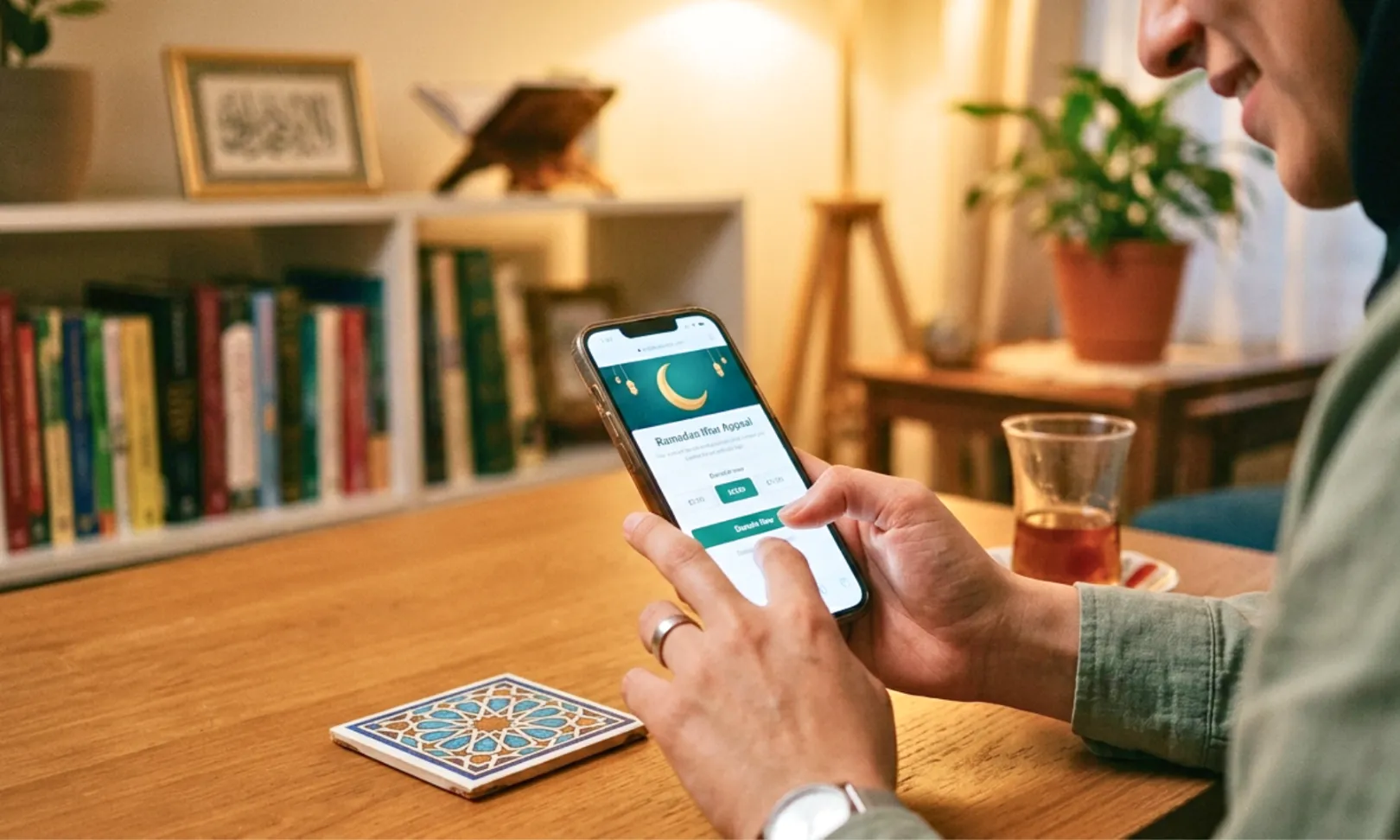
A donation landing page is not the same thing as your website’s general donation page, and treating them as interchangeable is where most Muslim nonprofits lose donors they already had. Your donation page is the one evergreen page every visitor can reach from your main navigation. A donation landing page is built for one specific campaign, a Ramadan Iftar appeal, a Qurbani drive, a mosque building fund, and it exists to match whatever ad, QR code or email drove someone there. If you need the deeper technical checklist for your general giving page, our donation page optimization guide covers that in full. This piece is about the campaign-specific page instead.
This matters more than it sounds like it should. If you have not yet built the broader case for why online giving needs attention at all, our guide to increasing online donations is the place to start before this one.
1. Match the Landing Page to Whatever Drove the Click
If a donor clicks a Facebook ad about your winter food drive and lands on a generic homepage donation form, you have already lost a meaningful share of them before they read a word. The page has to continue the exact conversation the ad started, same headline idea, same photo style, same specific ask. Our guide to the campaigns driving traffic in the first place covers how to run the ads, QR codes and social pushes that feed this page, this section is only about what the page itself needs to do once that traffic arrives.
One goal, one page. A Ramadan Iftar landing page should not also be asking for Zakat calculations, Qurbani pledges and general Sadaqah in the same breath. Each campaign earns its own page with its own single ask, even if that means maintaining three or four simple pages instead of one page trying to serve everyone.
2. Give the Donation Landing Page One CTA, Not Three
Every additional button competes with the one you actually want clicked. A donation landing page with a “Donate Now” button, a “Learn More” link and a “Share This Campaign” icon all fighting for attention above the fold will underperform a page with a single, repeated call to action every single time. Put the donate button above the fold, repeat it once more further down the page after the impact story, and remove or visually de-emphasize everything else that is not directly in service of that one action.
This is one of the easiest fixes on this list to implement and one of the most commonly ignored, mostly because it feels wrong to remove a share button or a navigation menu from a page. Do it anyway. A campaign landing page is not the place for site navigation.
3. Treat Load Speed as a Donation Feature, Not a Technical Detail
A slow donation landing page is not a minor inconvenience, it is a direct revenue leak, and it disproportionately affects Islamic charities since so much traffic arrives from a phone screen mid-scroll on Instagram or WhatsApp. Fundraise Up’s 2026 data found mobile donation pages currently convert lower than desktop, roughly 8 percent versus 11 percent, but the gap closes almost entirely once the page is actually built for mobile rather than just resized for it, with mobile transactions running faster than desktop when the experience is designed correctly.
Compress every image before upload, avoid embedding heavy video directly on the landing page itself (link out to it instead), and test the page on an actual phone with a weak connection, not just on a laptop with fast office wifi. A page that loads fine for you on fiber internet can still be losing donors on a slower mobile connection.
4. Add Trust Signals Without Turning the Page Into a Brochure
Donors who have never given to your organization before need a reason to trust a page they landed on thirty seconds ago, but cramming every credential onto the page at once buries the ones that actually matter. For Muslim donors specifically, a short line noting Zakat eligibility where applicable, your 501(c)(3) status, and one concrete number, families served, meals provided, funds raised so far this campaign, does more work than a wall of logos and testimonials.
Keep it to two or three signals placed near the donation button itself, not scattered across the page. A donor deciding whether to trust you is making that call in the few seconds right before they click donate, not while reading your mission statement in the footer.
5. What Strong Donation Landing Page Examples Have in Common
Across the donation landing page examples that consistently convert well for Islamic charities, the pattern is the same regardless of campaign size: a specific headline naming the exact cause, one photo or short clip showing real impact rather than a stock image, a single donation amount pre-selected as the suggested default, and a donate button that stays visible without needing to scroll back up. Average nonprofit donation conversion sits somewhere in the high teens to low twenties percent range industry-wide, and pages following this pattern consistently land on the higher end of that range rather than the lower one.
What separates a strong example from a weak one is rarely design polish. It is almost always the absence of distraction, one page, one story, one ask, one button.
Frequently Asked Questions
Q1. What is the actual difference between a donation page and a donation landing page?
A donation page is the one general, always-on page linked from your website navigation. A donation landing page is built for a single campaign and matched to whatever ad, QR code or email brought the visitor there. Most organizations only need one donation page but should build a new landing page for each significant campaign.
Q2. How fast does a donation landing page need to load?
Aim for under three seconds on mobile, and test on an actual phone with average connection speed rather than office wifi. Every additional second of load time before the page finishes rendering costs completed donations, particularly for the mobile-heavy traffic most Islamic charity campaigns receive from social platforms.
Q3. How many calls to action should a donation landing page have?
One. Repeat the same donate button once more further down the page if it is long, but avoid competing calls to action like share buttons, newsletter signups or full site navigation on a campaign-specific landing page.
Q4. Does every fundraising campaign really need its own landing page?
For any campaign running paid ads, a QR code or a dedicated email push, yes. Sending that traffic to a generic homepage donation form instead of a matched landing page is one of the more common and most fixable reasons a campaign underperforms its actual reach.
Q5. What do the best donation landing page examples have in common?
A specific headline naming the exact cause, a real photo or short video instead of stock imagery, a pre-selected suggested donation amount, and a single visible call to action with nothing competing for attention around it.